Playfield Brand
idea → retail
Hannah’s Role Brand Creative Director, Logo and Brand Visual Asset Designer, Photo Art Director, Product Design Collaborator
Challenge How do you sell a product idea to integrate pets into life on the go?
![]()
![]()
![]()
![]()
![]()
![]()
![]()
![]()
![]()
![]()
![]()
![]()
![]()
![]()
![]()
![]()
![]()
![]()
![]()
Playfield Founder & Photoshoot Producer Ivana Tay Dahlen, Google Alum
Photographer Natasha Gerschon
Photoshoot Set & Props Teryn Clancy Photoshoot Wardrobe Stylist Zoey Godenir
Challenge How do you sell a product idea to integrate pets into life on the go?
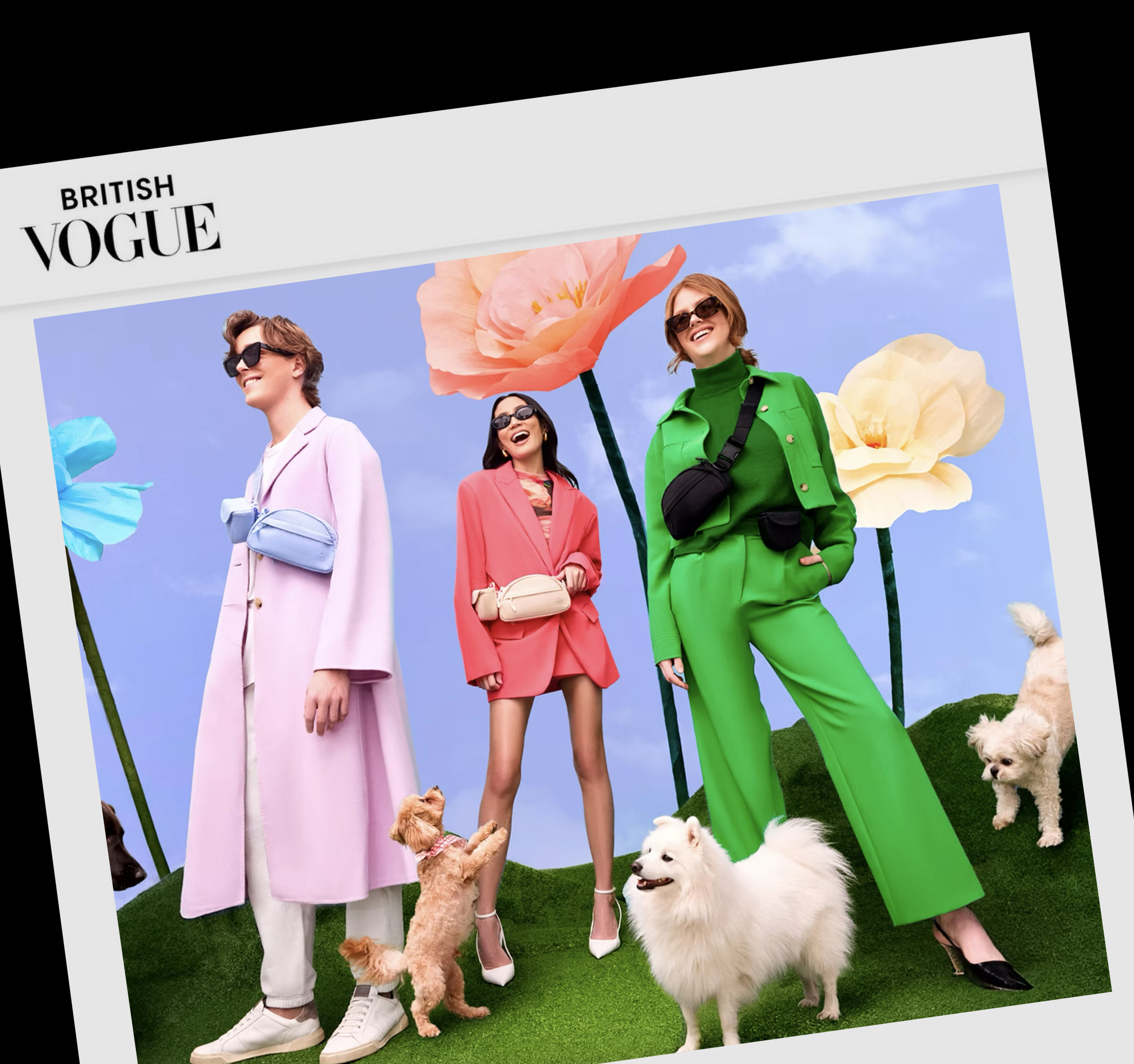
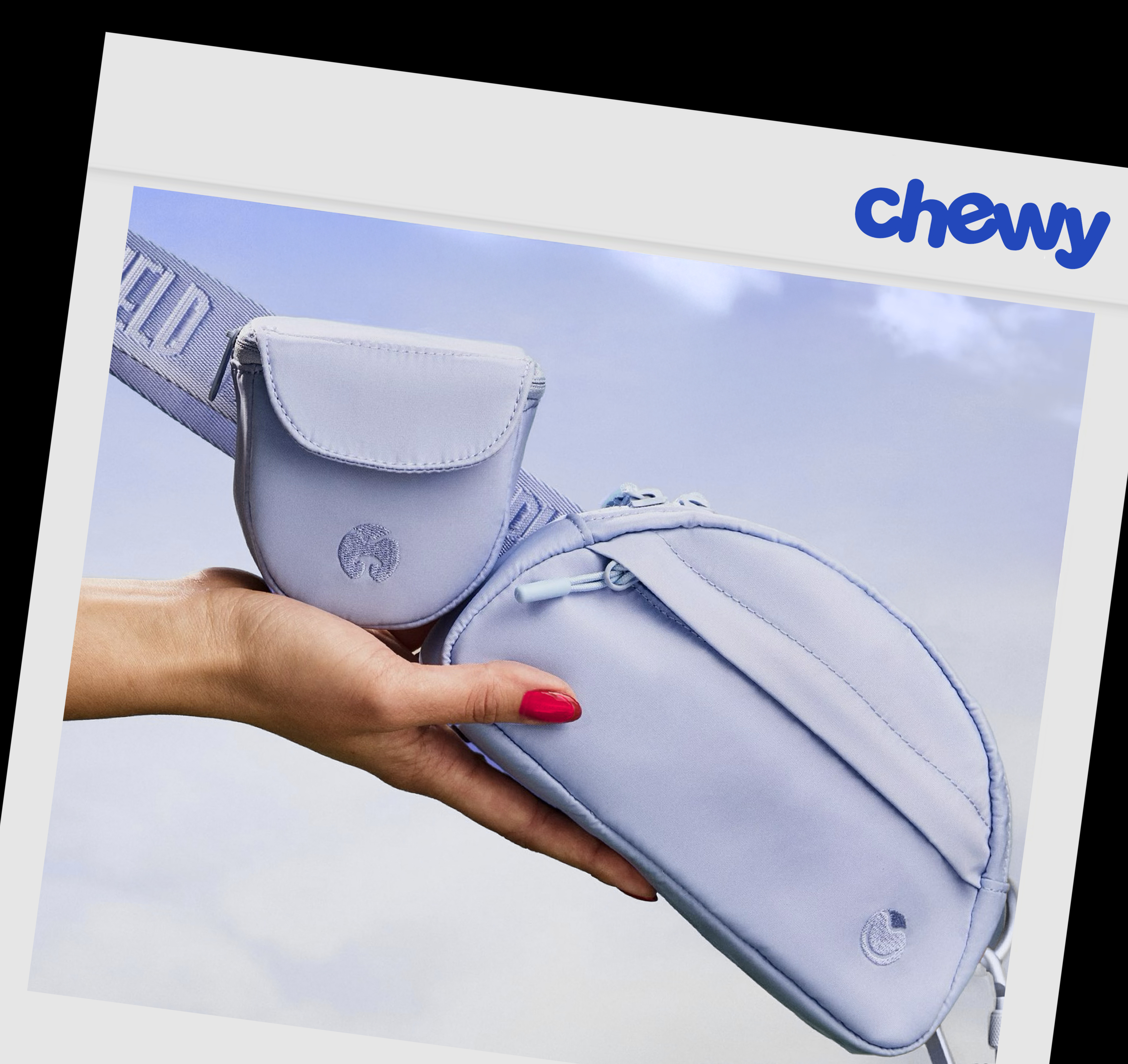

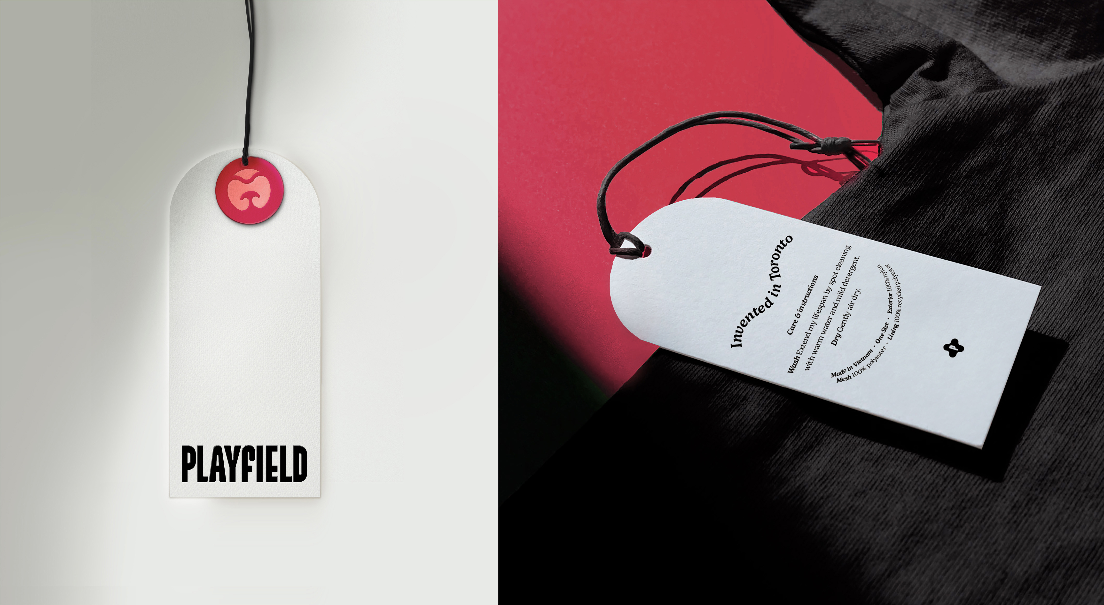

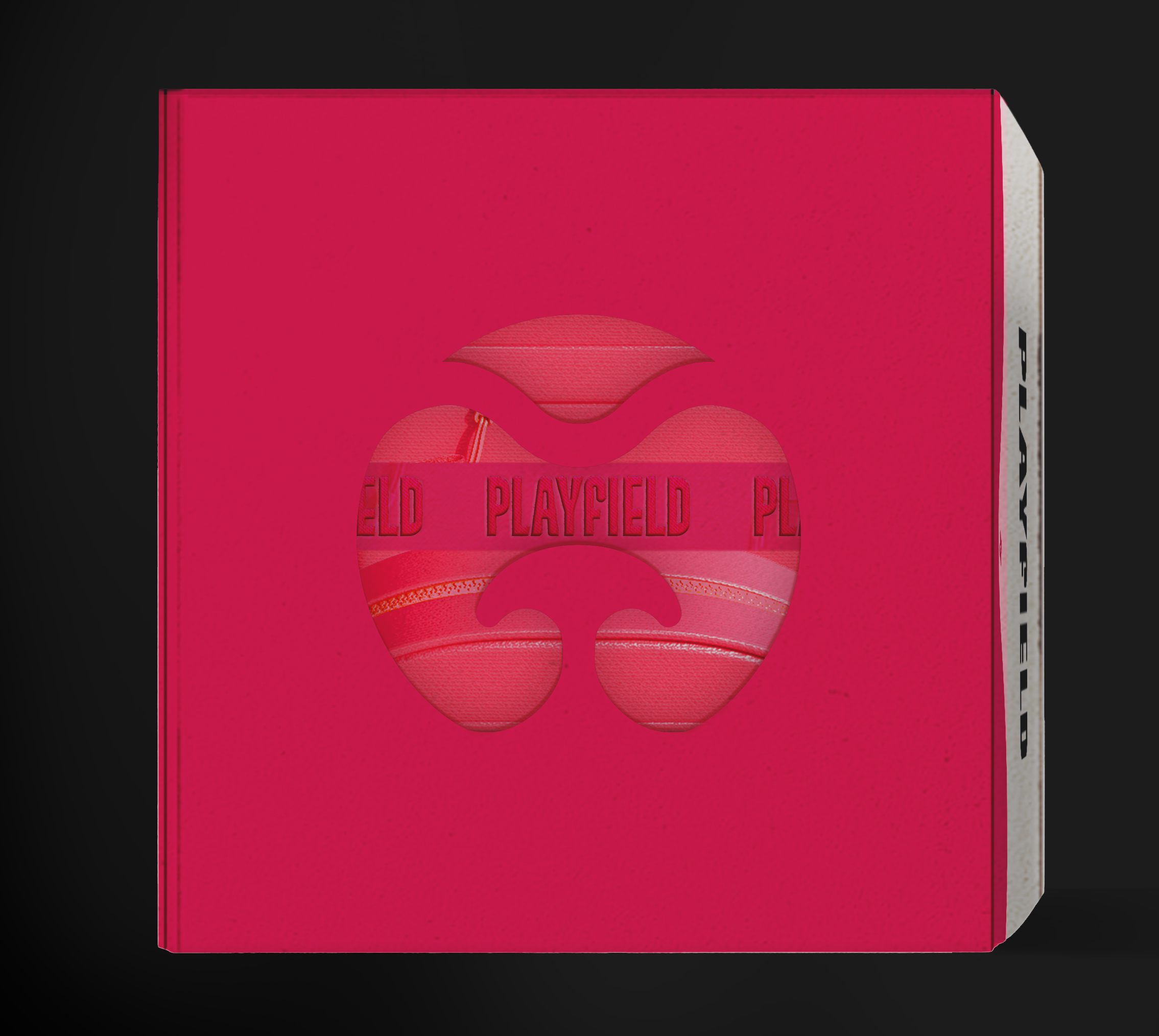
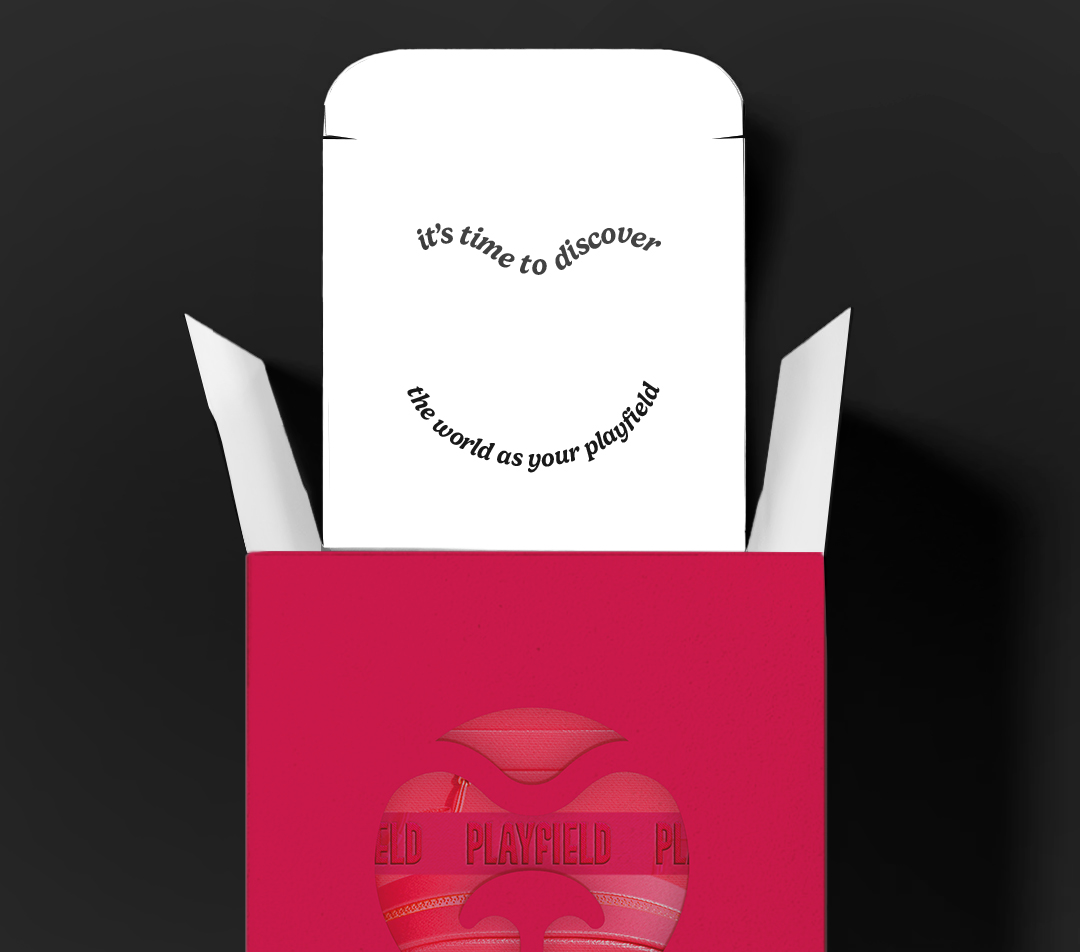
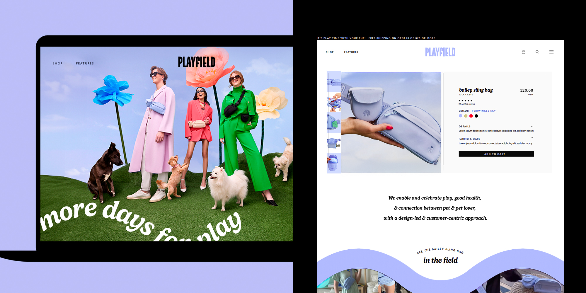

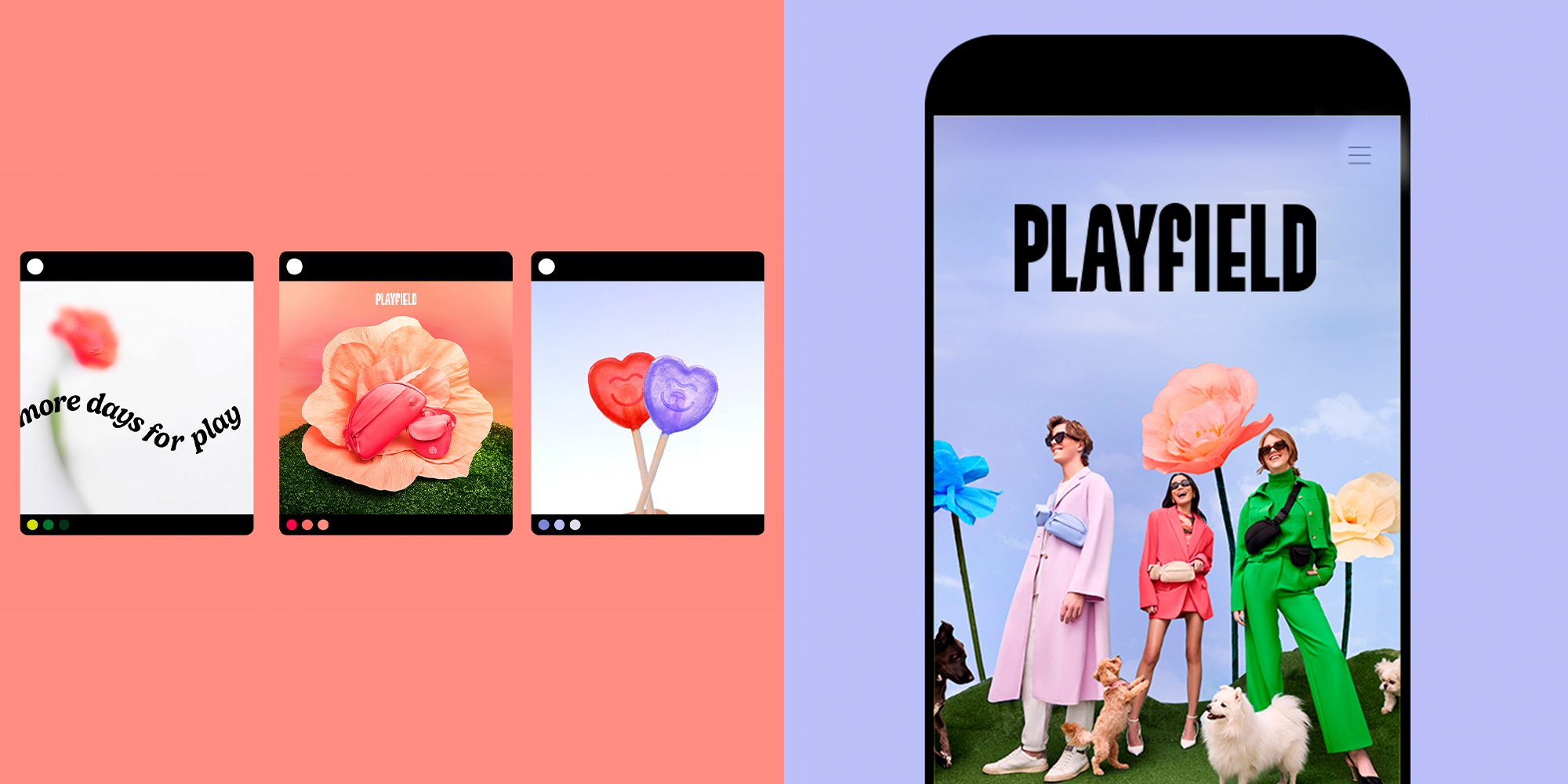
Result Brand visuals feaurted in Vogue 4 times in brand launch year + brand product sold online in retail with Chewy Stockist in brand’s year 2
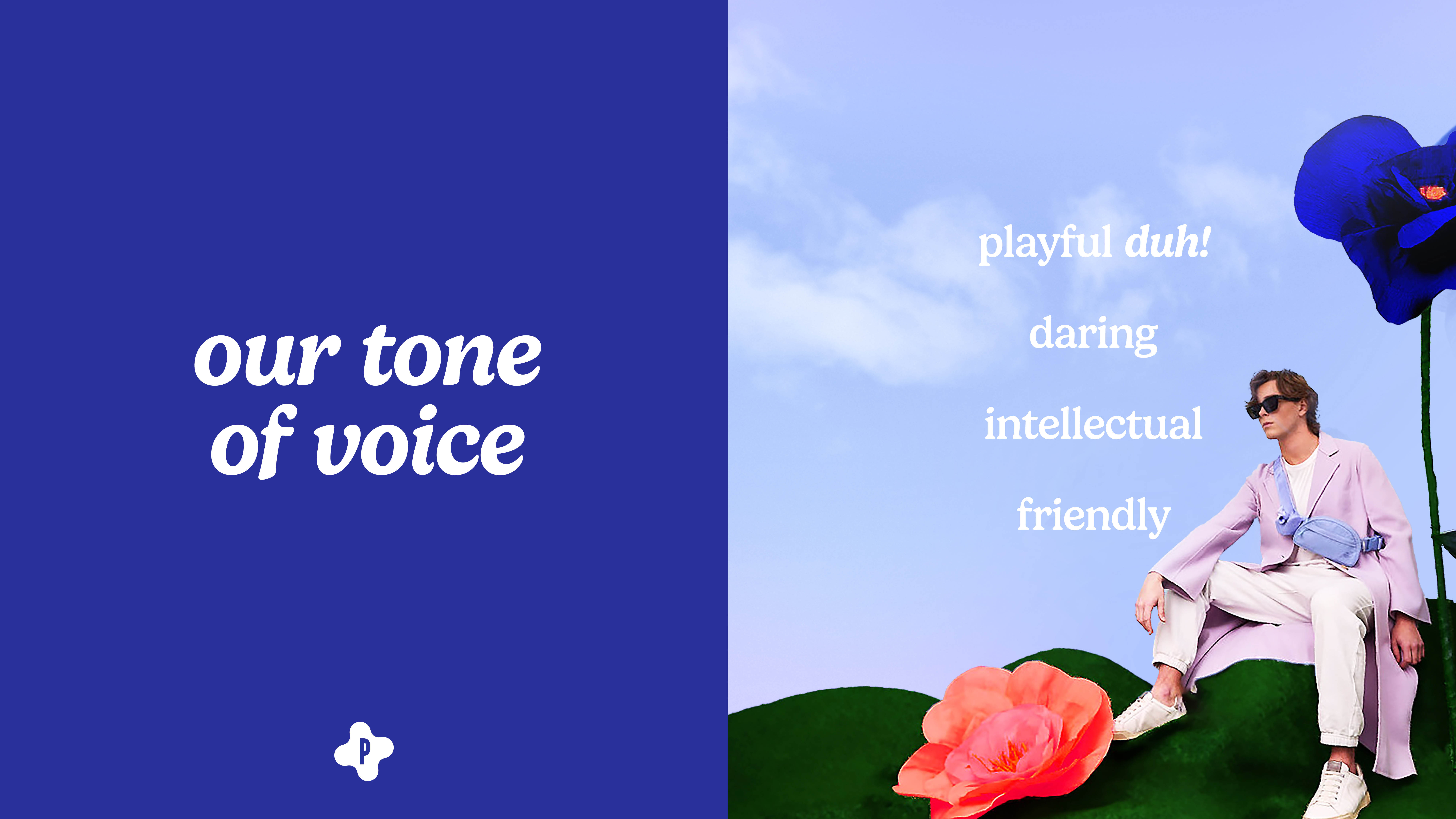
Solution I defined the brand by positioning the identity as an aspirational place, seen in the design system and photography of the brand visuals. The brand encourages pets and their people to build a stronger connection with each other while exploring the world as their Playfield.
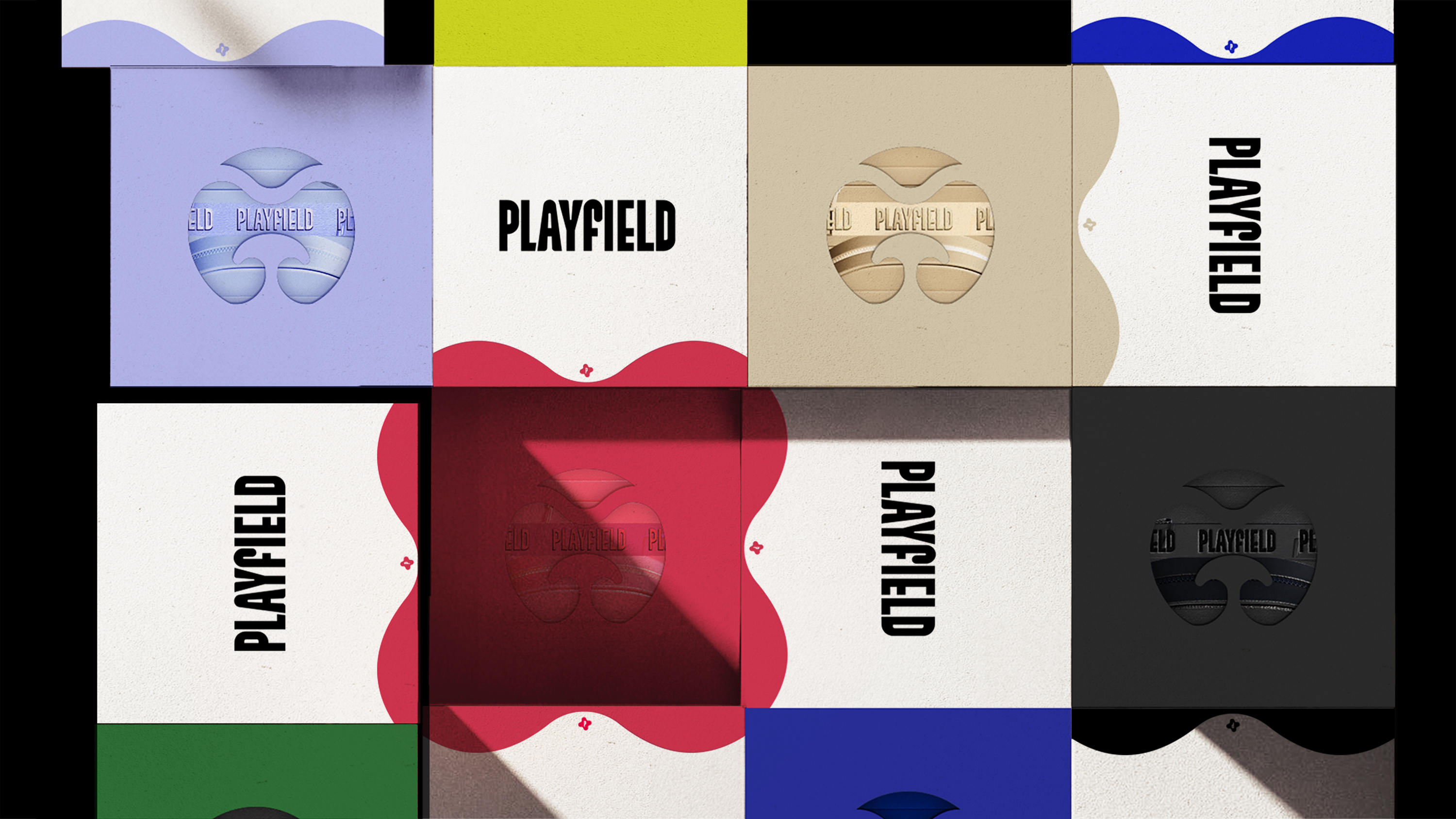
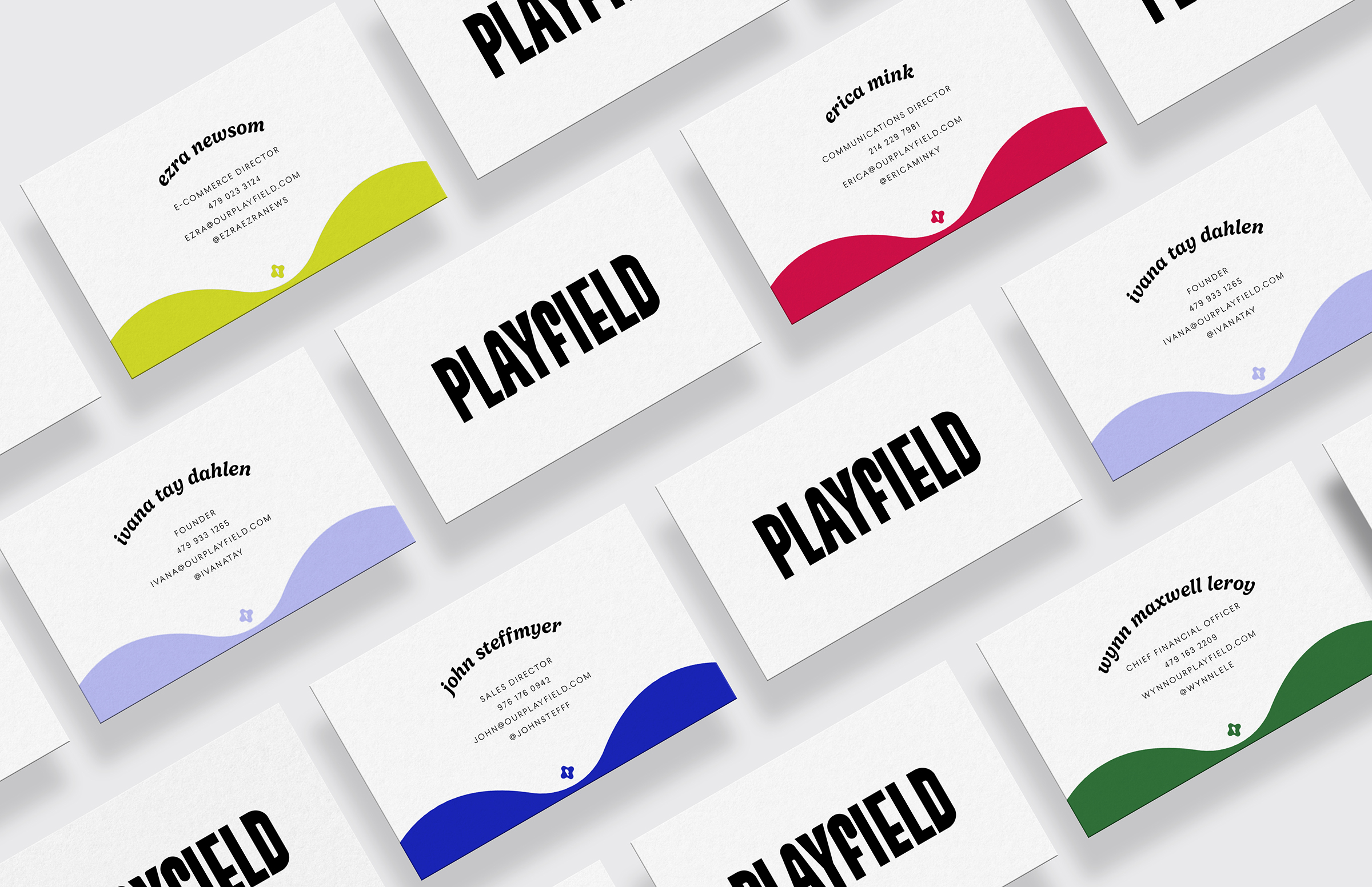
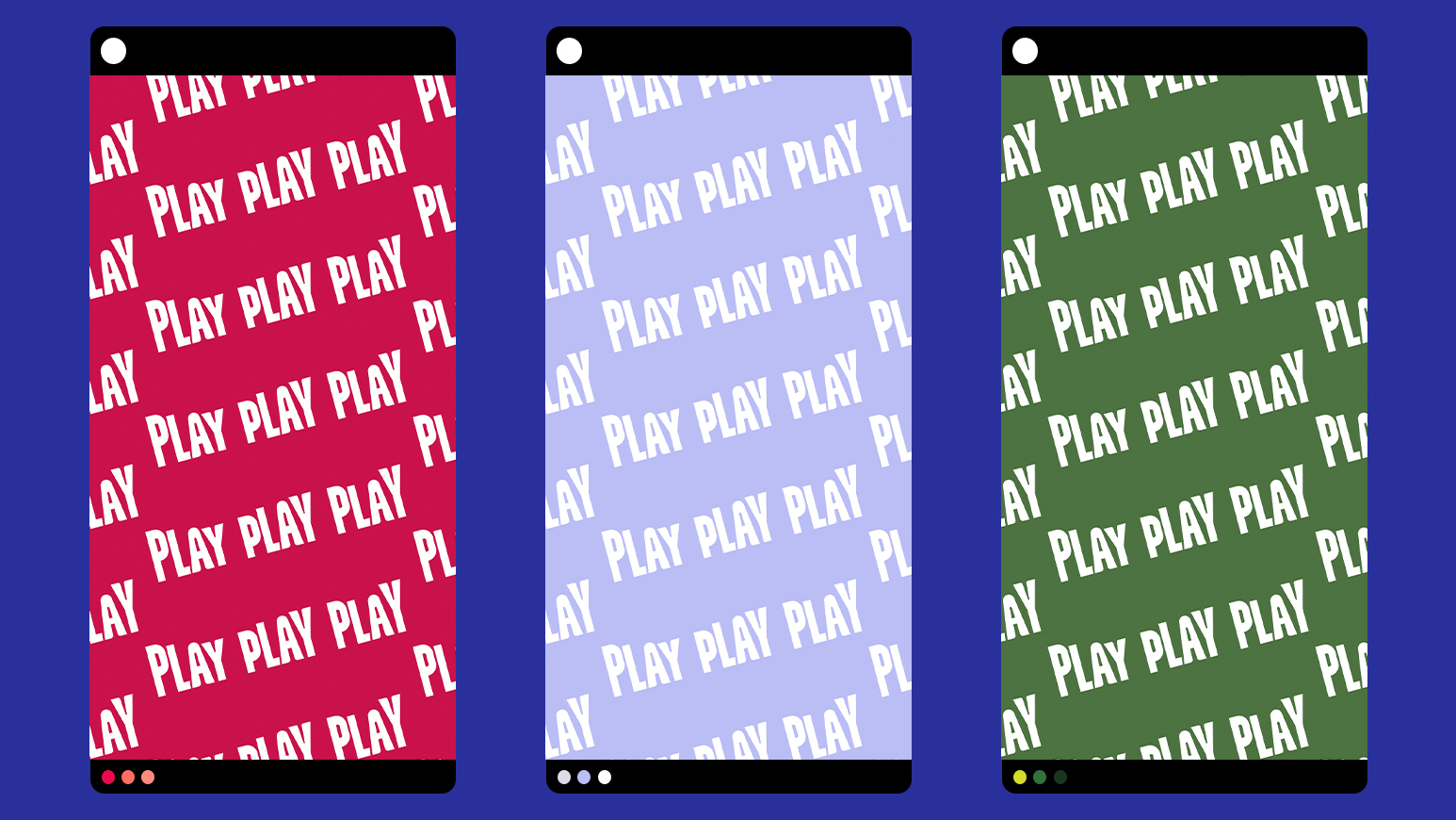
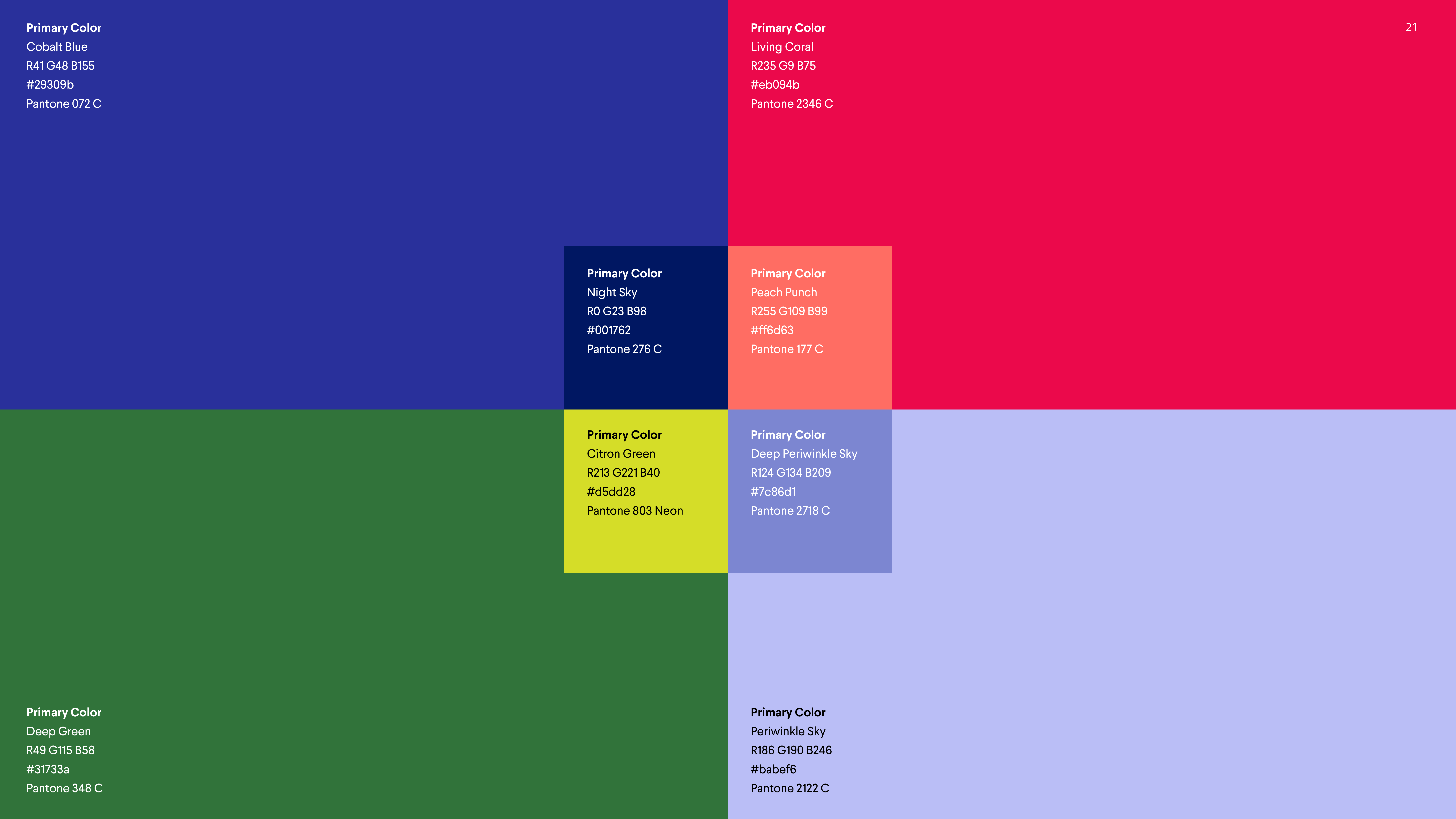
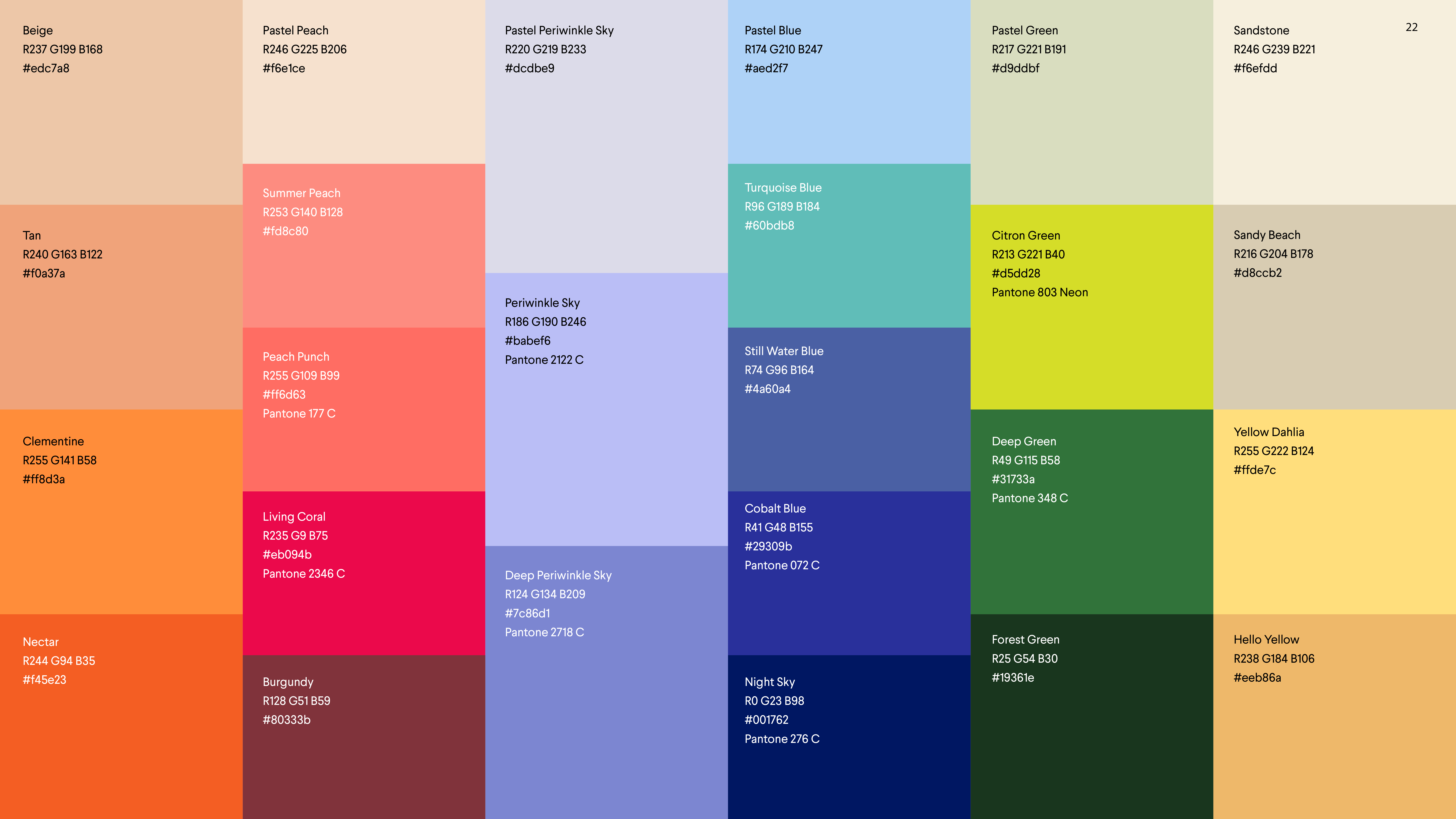
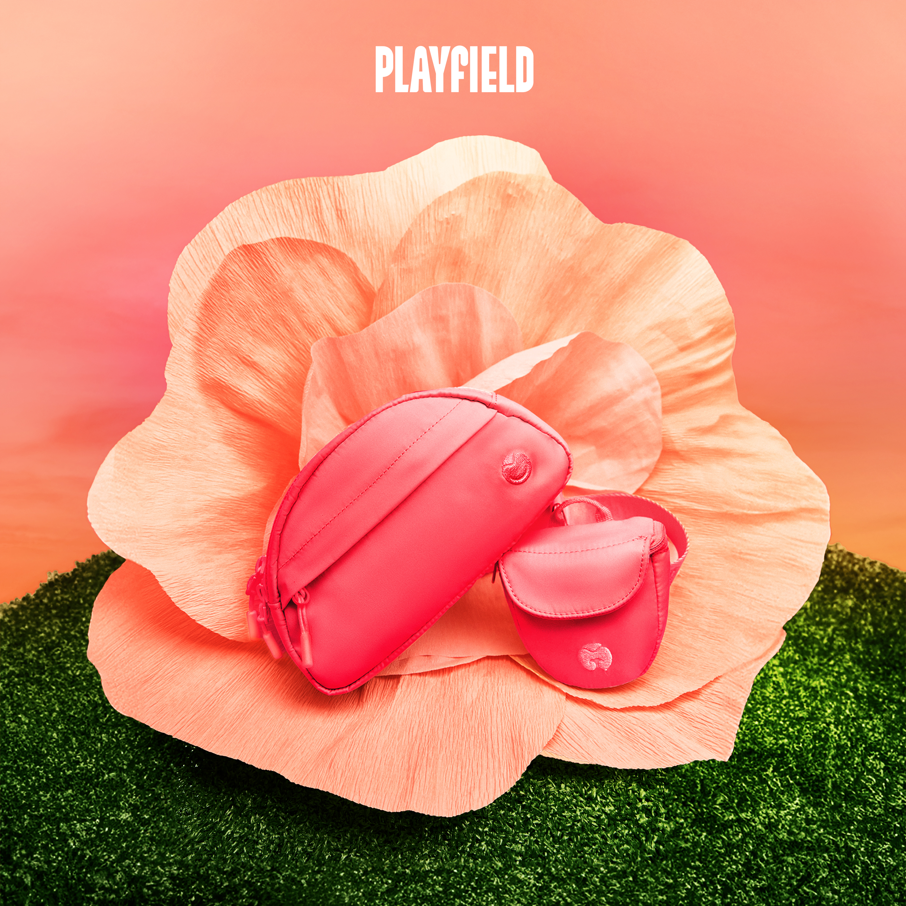
After strategizing the brand purpose and then defining the brand name, color theory development became the key foundation for the visual identity. To connect with Playfield’s target audience who live in metropolitan cities, the visuals and product colorways bring the beauty of the natural world to them. The Living Coral brand color is inspired by saturated roses and is set against analogous orange sunsets. I knew the high chroma brand visuals had to strike a balance in order to connect with the fashion-centric target audience, so I contrasted the high chroma against stark black and white typography as a confident statement.
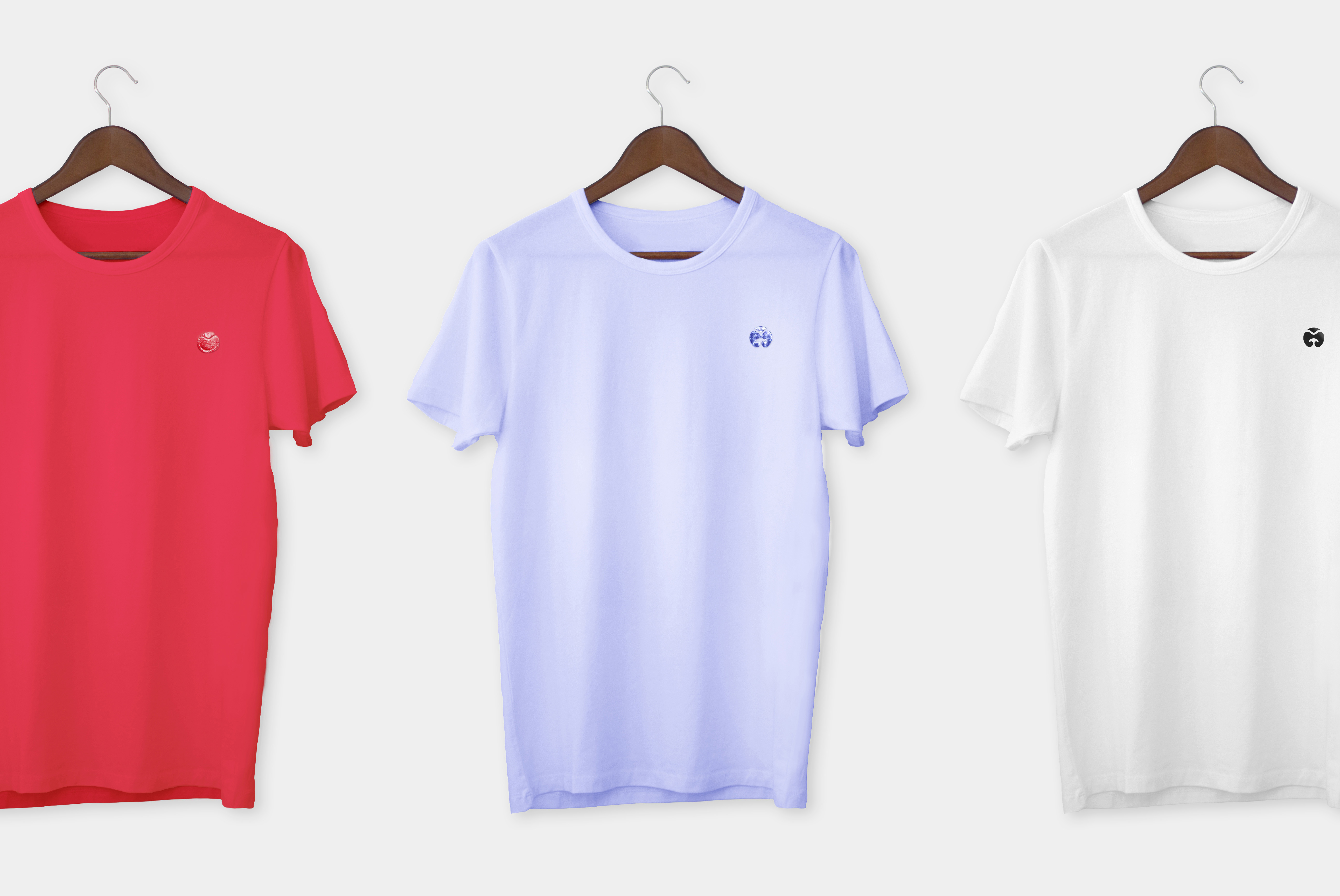
To visualize the brand strategy of fostering the connection between pets & their people, the brand features 2 face icons: a dog smiley face and a human smiley face. The faces are carefully designed with squinting eyes to express joy, like a dog sunbathing or a person laughing. The curves in the squinting eyes are formed from the shapes of the Playfield hills in the identity system.
The Playfield hero product, the Bailey Kit which is a multifunctional dog walking kit, features the 2 embroidered face icons. The human smiley face is housed on the sling bag which is primarily used for human items and the dog smiley face is housed on the treat pouch which is separated for cleanliness. The 2 bags attach to one another on one strap, physically connecting the 2 icons together to visualize the brand strategy paying off. The shape of the kit echos the design of the curves in the custom logotype.
Now our Playfield is a place I want to visit. Will you join me?
Playfield Founder & Photoshoot Producer Ivana Tay Dahlen, Google Alum
Photographer Natasha Gerschon
Photoshoot Set & Props Teryn Clancy Photoshoot Wardrobe Stylist Zoey Godenir

